Slice 'n' Brew is an independent pizza restaurant in Nottingham with a strong following. I designed and built their website in Webflow around a year after they opened.
Freelance @ Slice 'n' Brew
Key highlights
- Still live 3+ years later
- Launched just before their social media growth took off — a credible online presence at the right moment
- Designed for atmosphere and function — bold visuals, easy booking, clear information
- Visually ahead of almost any restaurant website you'll find
The problem
Slice 'n' Brew had opened with a basic Squarespace site that didn't reflect who they were. The restaurant had personality, reputation, and a growing following — but none of that came through online. They needed a website that matched the energy of the physical space and made it easy for customers to book a table and find key information.
Approach
I started with conversations with the owner to understand what made the place tick — the vibe they'd built, who their customers were, and what they actually needed the site to do. From there, I focused on two things: capturing atmosphere through bold visual choices, and making sure the practical stuff (menus, booking, location) was effortless to find.
What I did
- Visual design (full site)
- Webflow development
- Information architecture and navigation
One decision, explained
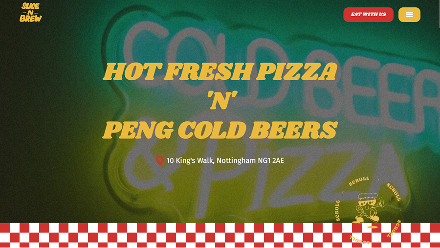
The homepage opens with an autoplay video — which can be a risky choice. But for Slice 'n' Brew, it made sense: the atmosphere is the product, and video captures that better than a static image ever could.
To make it work without hurting usability or performance, I added a subtle overlay and blur treatment so the video enhances rather than overwhelms. I also considered how the site would behave on low-power mode or slower connections — the video is a progressive enhancement, not a dependency.
The outcome
The site launched right as Slice 'n' Brew started gaining serious traction on social media. It gave them a strong, credible digital presence during a key growth window — and it's still running today, unchanged, years later. They've gone from a promising local spot to fully booked mid-week, and the website remains central to how people discover and engage with them.
Reflection
If I rebuilt this today, the development would be cleaner and I'd push some of the design details further. But the core decisions — prioritising atmosphere, balancing visual impact with usability — still hold up. And the fact that it's still live and doing its job is the best proof that the foundations were right.