Freelance project

Design & Webflow build @ pici

I designed and built the Webflow site for an independent Italian-inspired pasta restaurant in Nottingham, launched before the doors opened.

Live project
Role
Design & Webflow build
Client
Pici, Nottingham
Team
Solo, working with the two founders
Scope
Visual design, Webflow build, Art direction, Performance
  • Launched ahead of the restaurant opening, so there was a site from day one.
  • Minimalist design that lets the food and the atmosphere speak.
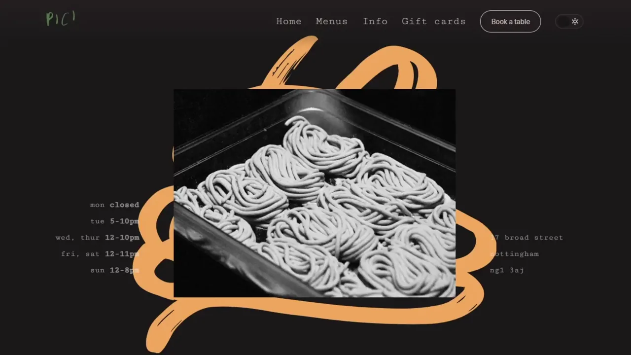
  • Custom animated photo montage hero, built as one APNG to keep the page light.

Overall results and highlights

  • Fully booked since the doors opened.
  • Still live a year on, unchanged.
  • Consistent praise on social media since it went up.

The food was the brand, so the site got out of the way

Pici needed a website ready for launch, but this wasn't a brand-heavy project. The restaurant's appeal is the food and the atmosphere. Two chefs doing things properly, self-funded, no gimmicks.

The site had to reflect that. Confident, minimal, and elevated without being pretentious. It also needed to hold its own against high-end independents like Onda in Manchester.
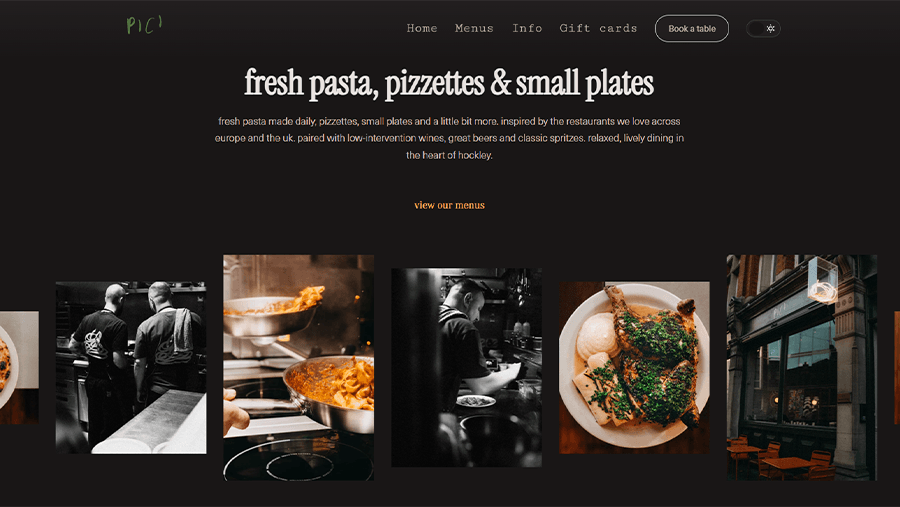
Pici's fresh pasta, pizzettes and small plates section. A line of mostly black-and-white kitchen and dining photographs under serif type.
The gallery band. Black-and-white kitchen shots against serif type. The photography carries the page, so the layout stays out of its way.

Making minimal feel intentional rather than empty

I worked closely with the founders through regular check-ins during the design process, to make sure the direction felt right. The brief pushed towards restraint. Strong typography, a limited colour palette, and letting the photography do the heavy lifting.

The challenge was making minimal feel intentional and premium rather than empty. I did the visual design across the full site, built it in Webflow, art-directed the hero montage, and put a good share of the time into image optimisation and performance.

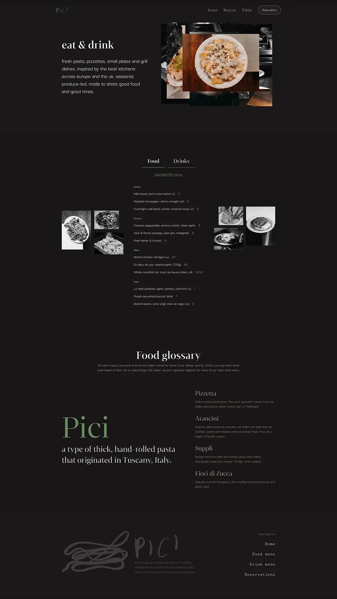
The top of Pici's menu page. Eat and drink, beside a stack of overlapping dish photographs.
The menu page. No decoration and nowhere to hide.

Twelve photographs, 200ms apart, instead of video

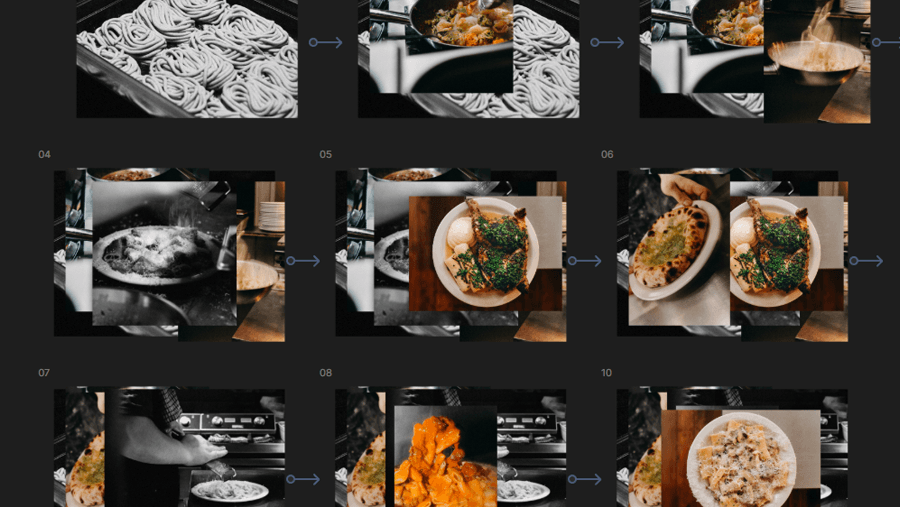
The hero needed to capture atmosphere without using video. I made an animated photo montage instead. Around 12 images cycling on a 200ms delay, layered at slightly different sizes and positions, like someone dropping printed photos onto a table.

The tricky part was keeping the file size manageable. I used APNG to get the animation quality I wanted without bloating the page or breaking on older devices. It gives the site a tactile feel that a static image or a standard slider wouldn't have.

Ten numbered frames of the hero montage, each one adding another photograph on top of the last.
The montage assembled frame by frame. Each photograph lands at a slightly different size and angle, and the whole sequence is one APNG, small enough that the most distinctive thing on the site costs the page almost nothing to load.

Restraint was right, even where I'd have pushed further

The site launched alongside the restaurant and has been live for about a year. Pici has been fully booked since opening, and the site has picked up consistent praise on social media.

If I'd had more room I'd have pushed the creative direction further, but the restraint was right for this one. It reflects who the founders are and how they run the restaurant.