Freelance project

Design & Webflow build @ slice 'n' brew

I designed and built the Webflow site for an independent pizza restaurant in Nottingham, around a year after they opened.

Live project
Role
Design & Webflow build
Client
Slice 'n' Brew, Nottingham
Team
Solo, working with the owner
Scope
Visual design, Webflow build, Information architecture
  • Designed for atmosphere and function. Bold visuals, easy booking, clear information.
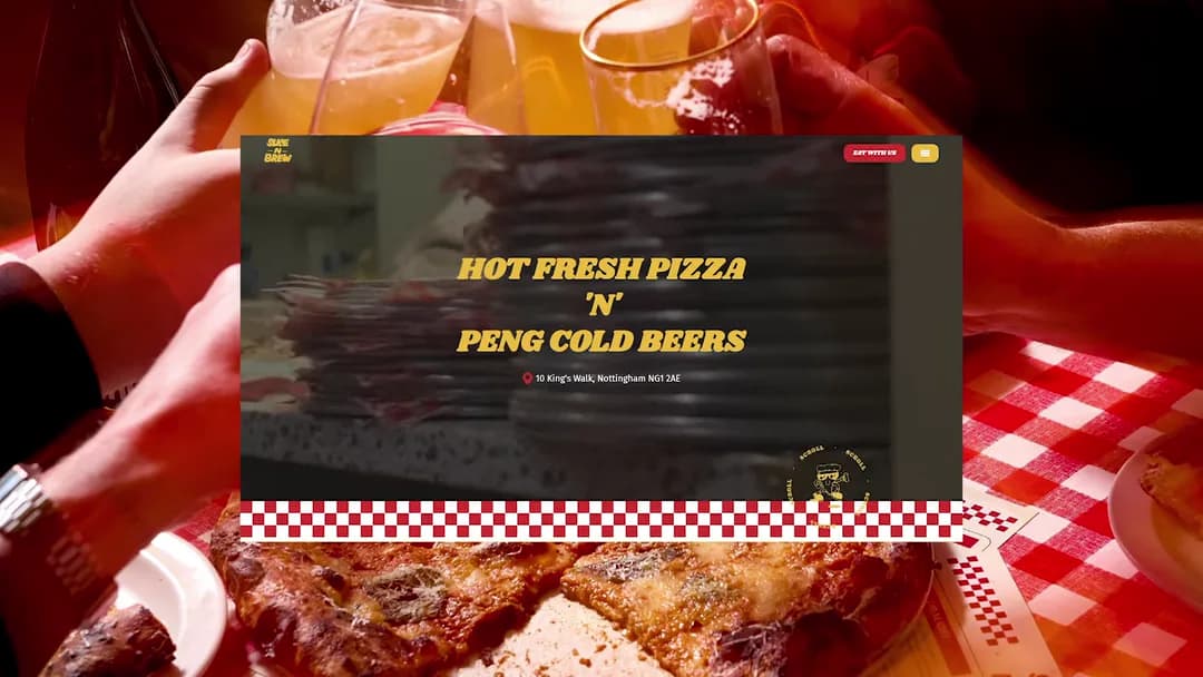
  • Autoplay video hero, blurred and overlaid so it stays readable and compresses hard.

Overall results and highlights

  • Fully booked mid-week, from a promising local spot.
  • The essence of the site lives on three years later, with only minor facelifts.
  • Launched into their growth window, a credible presence at exactly the right moment.

A room full of personality, and none of it online

Slice 'n' Brew had opened on a basic Squarespace site that didn't reflect who they were. The restaurant had personality, reputation and a growing following, but none of that came through online.

They needed a website that matched the energy of the physical space, and made it easy for customers to book a table and find the information they'd come looking for.
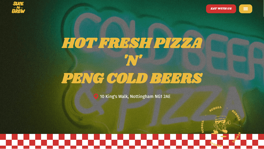
The Slice 'n' Brew homepage over a green neon cold beer and pizza sign, with a red checkerboard band along the bottom.
The replacement. The neon behind it is the room itself, and the brief was that the site should feel like walking in.

Autoplay video was the right risk here

The homepage opens with an autoplay video, which can be a risky choice. But for Slice 'n' Brew it made sense. The atmosphere is the product, and video captures that better than a static image ever could.

It carries an overlay and a blur treatment, which were as much about usability and performance as they were about the look.

The hero as it runs. The blur and the overlay are doing two jobs at once. Holding the headline legible over moving footage, and letting the video compress far harder than a clean frame ever would.

The overall process, from discovery to build

I started with conversations with the owner to understand what made the place tick. The vibe they'd built, who their customers were, and what they actually needed the site to do.

From there it came down to two things. Capturing the atmosphere through bold visual choices, and making sure menus, booking and location were effortless to find. I did the visual design across the full site, built it in Webflow, and worked out the navigation and information architecture as I went.

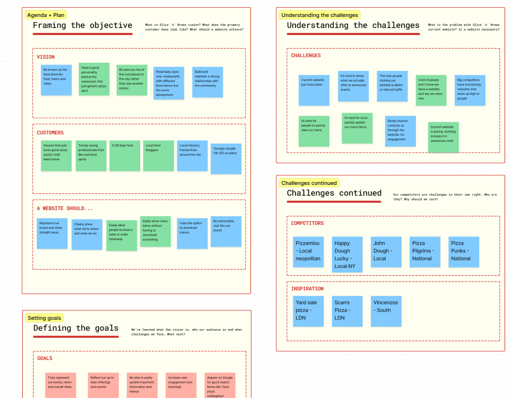
A discovery board. The restaurant's vision and customers on sticky notes, the problems with the old site, and a list of competitors and inspiration.
Discovery, before any design. What the owner wanted the place to be known for, who was actually coming, and what the old site was failing to do about either.
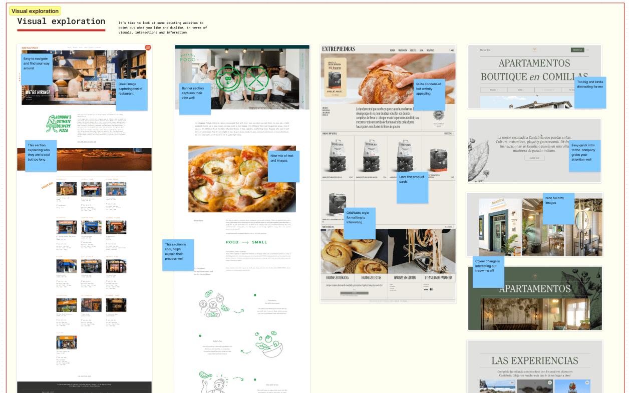
A visual exploration board. Five restaurant and food websites pulled apart with annotations on what works and what doesn't.
Visual exploration. Taking apart sites that got it right and noting exactly why.

Three years on, still the same site

The site launched right as Slice 'n' Brew started gaining serious traction on social media, so it gave them a credible digital presence during a key growth window. They've gone from a promising local spot to fully booked mid-week, and the site is still central to how people discover them.

If I rebuilt it today the development would be cleaner and I'd push some of the design details further. But the core decisions still hold up. Prioritising atmosphere, and balancing visual impact against usability.

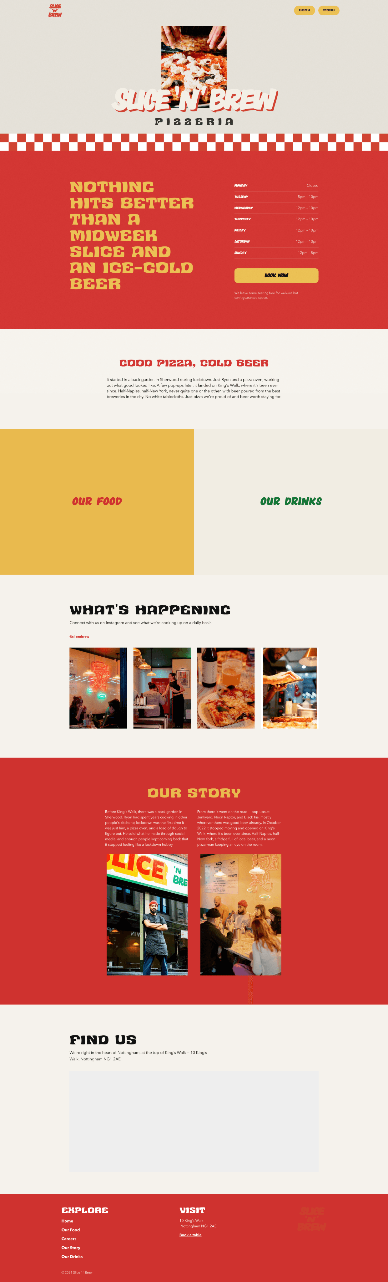
The finished Slice 'n' Brew homepage in full, from the hero through what's happening, our story, and find us.
The homepage as it shipped, top to bottom.
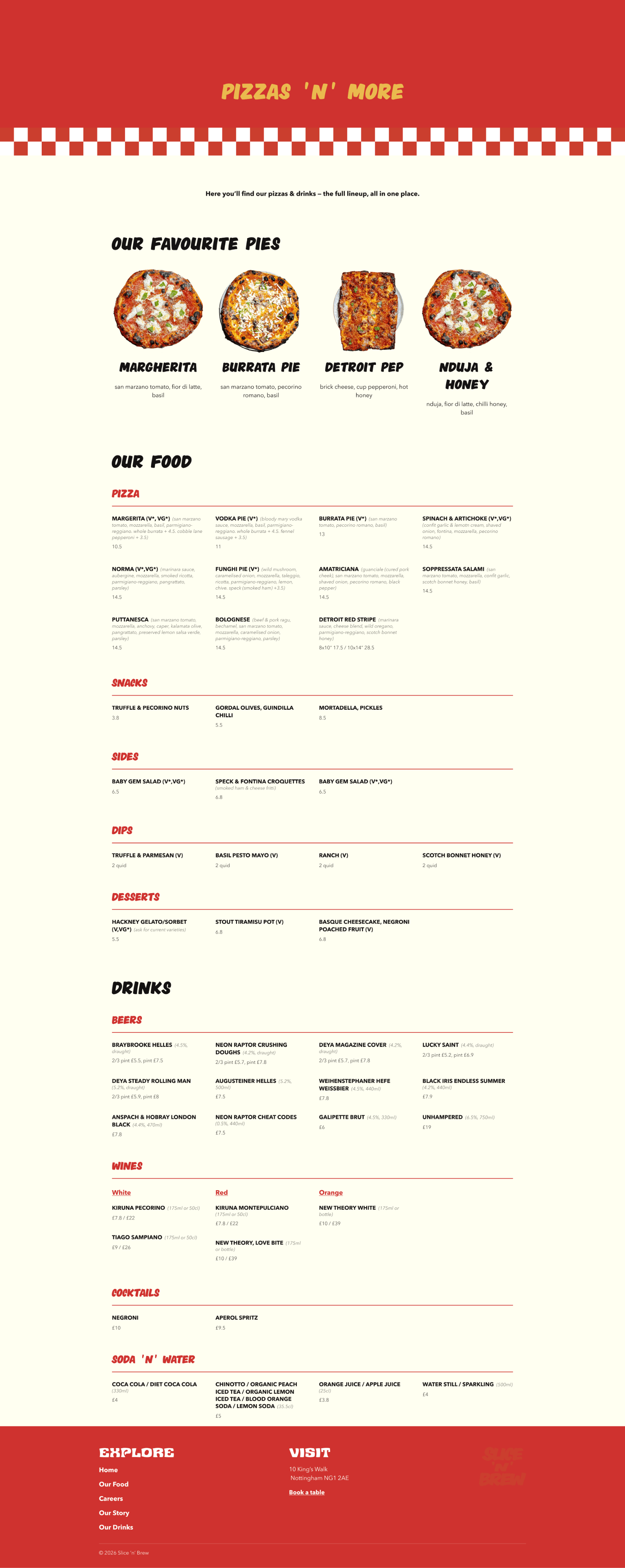
The finished menu page. Pizzas, sides and drinks laid out to scan in one scroll.
The menu as a page you scan, not a PDF you download. It is the one requirement the discovery board kept coming back to.